It's a common task to validate forms in order to receive the correct information and reduce errors. This validations are commonly done using javascript and for multiple cases, we use js to validate things that the HTML can already handle by itself. So in this article we will see how to keep our validations without using js.
Handling what the users input
The most common attribute to use on form elements is perhaps required, which makes the field obligatory and won't complete the form action until they are all filled. But it still does not guarantees that the user will input the information correctly.
For example we can have our input for the users workplace and be required. The user can just write a single letter and it would be enough to consider it valid. To avoid cases like this we can implement a set properties to define the correct way to input the information.
The maxlength and minlength properties
Taking back the case of the user workplace, we can specify that a valid input would have at least 4 characters, this can be done using the property minlength.
<form onsubmit="sendAlert(event)">
<input type="text" minlength="5" required/>
 <input type="submit" value="Submit Form"/>
</form>

function sendAlert(e){
  e.preventDefault()
  alert("submit")
}
Also if we don't need a really long input to handle we can defined the maximum amount of characters with the property maxlength.
<form onsubmit="sendAlert(event)">
<input type="text" minlength="5" maxlength="100" required/>
 <input type="submit" value="Submit Form"/>
</form>

function sendAlert(e){
  e.preventDefault()
  alert("submit")
}
A little caveat is that if we don't use required on the input it will be valid when the form is submitted and will be sent empty.
The pattern property
This property is used to specify which format, using regular expression, the input value has to follow.
Lets say we want to defined that a valid email has to follow these formats name@domain.extension or name@domain.extension.second_extension.
<form onsubmit="sendAlert(event)">
<input
type="email"
pattern="[A-Za-z0-9._%+-]+@[a-z0-9.-]+\.[a-z]{2,}$"
equired/>
 <input type="submit" value="Submit Form"/>
</form>

function sendAlert(e){
  e.preventDefault()
  alert("submit")
}
By using the pattern property with the regular expression we are declaring that the email has to follow the next order:
username: can have upper and lowercase characters, numbers and the special characters _ , % , + , - , .
@ symbol
domain: can have lowercase characters , numbers and the special characters - and .
extension: at least two lowercase characters .
We can use another example, now for the password. Lets defined that a valid password would have at least 8 characters, at least one uppercase letter and one lowercase letter, numbers and can contain special characters but these will be optional.
<form onsubmit="sendAlert(event)">
<input
type="password"
pattern="^(?=.*\d)(?=.*[a-z])(?=.*[A-Z])(?=.*[a-zA-Z]).{8,}$"
required/>
 <input type="submit" value="Submit Form"/>
</form>

function sendAlert(e){
  e.preventDefault()
  alert("submit")
}
Input number
When handling the input number values we come to use js to validate since browsers have different ways to validate. For example chrome would only allow numbers and the characters e E and - when writing on the input but firefox would let you enter any text. So with a little js we can uniform the validation.
<form onsubmit="sendAlert(event)">
<input type="number" required/>
 <input type="submit" value="Submit Form"/>
</form>
Validation code with js:
let input = document.querySelector('input');

input.onkeydown = updateValue

function updateValue(e) {
  const isValidCharacter=["KeyE","Period","Slash"].includes(e.code)
  const isDigit= e.code.includes("Digit")
  return isDigit || isValidCharacter ? true : false
}
We can modify the validation in case wee need other types of number input like just integers, the amount of decimals after the point,etc.
Another point to remember, when using the min max step properties with an input type number is that they will only work if the user insert the numbers using the buttons the input provides, they will not be applied if the user enters them by keyboard.
Dealing with multiple option elements
When exposing multiple options for the user to choose there some cases to consider:
- Present a set of options and always one has to be selected
When presenting a set of options where one needs to be selected, for example when using select or radio buttons we can either use the required attribute set an option selected by default.
Select
With required the form will not let the user submit until a option is selected
<form>
<select id="colors" name="select" required>
      <option value="red" >RED</option>
      <option value="green">GREEN</option>
      <option value="blue">BLUE</option>
    </select>
<input type="submit" value="Submit selection"/>
</form>
When setting the attribute selected to an option, it will be the value of the select element and the one the form will submit if user does not choose a different one.
<form>
<select id="colors" name="select">
      <option value="red" >RED</option>
      <option value="green">GREEN</option>
      <option value="blue" selected>BLUE</option>
    </select>
<input type="submit" value="Submit selection"/>
</form>
Radio button
With required Will ask to choose an option
<form>
  <label htmlFor="pk1">Bulbasour</label>
    <input id="pk1" value="Bulbasour" name="pokemon" type="radio" required/>
     <label htmlFor="pk2">Charmander</label>
    <input id="pk2"  value="Charmander" name="pokemon" type="radio" required/>
     <label htmlFor="pk3">Squirtle</label>
    <input id="pk3"  value="Squirtle" name="pokemon" type="radio" required/>
  <input type="submit" value="Submit Form"/>
</form>
Will use the value of the input with the attribute checked
<form>
  <label htmlFor="pk1">Bulbasour</label>
    <input id="pk1" value="Bulbasour" name="pokemon" type="radio" cheked/>
     <label htmlFor="pk2">Charmander</label>
    <input id="pk2"  value="Charmander" name="pokemon" type="radio" />
     <label htmlFor="pk3">Squirtle</label>
    <input id="pk3"  value="Squirtle" name="pokemon" type="radio"/>
  <input type="submit" value="Submit Form"/>
</form>
Of course there will be cases where one of these approaches will be more suitable to use. Take the example of a poll were every options helps to get more accurate representation when representing the data obtained. There will be options representing personal likes of the person in which using required with no default option selected needs to be done in order to make the user select the best option that represents his likes.
Other times the default option can simplify things, like getting information about certain option or perform certain activity based on selection, we can already have specified the default behavior without validating if something is selected since it will always have one option set.
Handling checkbox
Checkbox are useful to represent options which the user might o might not want and can be perceive as options the use might or might not want. So we can describe its validation cases such as:
- User agreements: Using a required checkbox with conditions that the user has to agreed in order to use or have access to software, services, guarantee, etc. The most famous case being using it on I Have read and accept the terms and condition
<form>
  <label class="bottom-label" htmlFor="cb2">Accept terms and policies? <input id="cb2" name="types" type="checkbox" required /></label>
  <input type="submit" value="Submit Form"/>
</form>
- Optional user agreements: Checkbox can avoid the required attribute when working as a option or condition that does not really need to be accepted, such as news subscription.
<form>
     <label class="bottom-label" htmlFor="cb1">Subscribe for updates? <input id="cb1" name="types" type="checkbox" /></label>
  <input type="submit" value="Submit Form"/>
</form>
- Set of desires options: Use checkbox to present options that work as extras or additions to a previous selection. For example using them as options to add toppings to a previous made food order.
<form>
     <label class="bottom-label" htmlFor="cheese">Extra cheese<input id="cheese" name="types" type="checkbox" /></label>
 <label class="bottom-label" htmlFor="pepperoni">Extra pepperoni<input id="pepperoni" name="types" type="checkbox" /></label>
 <label class="bottom-label" htmlFor="cheese-crust">Cheese crust<input id="cheese-crust" name="types" type="checkbox" /></label>
  <input type="submit" value="Submit Form"/>
</form>
Giving feedback to user
The validations can pass unperceived until the users decide to submit the form and realize there are fields either empty or with filled wrong, but if we give feedback to show that a field is filled correctly or not and make the user notice, we can reduce the errors that can be done while filling the form.
For this scenario CSS can help us simplify things.
Showing when a field is valid
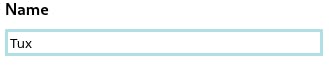
Using the pseudo-class :valid we can apply styles to a field that has been filled properly.
html:
<form>
     <label forHTML="name">Name</label>
     <input id="name" type="text" />
</form>
css
from input:valid{
  border: 3px solid powderblue;
}
If the input is using a pattern attribute, the style will be applied when the value is formatted according to regular expression defined.
<form>
     <label forHTML="email">E-mail</label>
     <input id="email" type="email" pattern="[A-Za-z0-9._%+-]+@[a-z0-9.-]+\.[a-z]{2,}$"/>
</form>
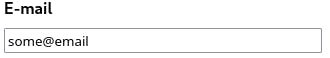
The email does not meet the established format to be considered as a valid one, so even if the field is not empty is still invalidated by the pattern.
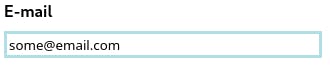
Now the user can see that the email is correct.
Take in mind that Every form element that does not include the attribute required is by default a valid one. Using the :valid pseudo-class, the styles will be applied to all elements that meet the requirement to be considered valid.
For example:
<form>
     <label forHTML="name">Name</label>
     <input id="name" type="text" />
     <label forHTML="email">E-mail</label>
     <input id="email" type="email" pattern="[A-Za-z0-9._%+-]+@[a-z0-9.-]+\.[a-z]{2,}$"/>
     <input type="submit" value="Submit" />
</form>
Since the submit button is an input without the required property, by default is already a valid element.
To avoid this we can be more specific about the elements we want the valid styles to be applied.
css
form input[type="text"]:valid, input[type="email"]:valid{
border: 3px solid powderblue;
}
Now the :valid styles only affect the input with types text and email
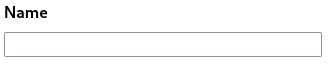
If we show the users when the field is valid we might as well show them when they leave an empty field or filled it wrong. We might think since we use the pseudo-class :valid now we have to use the pseudo-class :invalid. Well there is a little caveat that makes using it a little tricky because by default the form and all its elements that does not have a default value set will be view as invalid ones.
html:
<form>
     <label forHTML="name">Name</label>
     <input id="name" type="text" />
     <label forHTML="email">E-mail</label>
     <input id="email" type="email" pattern="[A-Za-z0-9._%+-]+@[a-z0-9.-]+\.[a-z]{2,}$"/>
</form>
css:
from input:valid{
  border: 3px solid powderblue;
}

from input:invalid{
  border: 3px solid red;
}
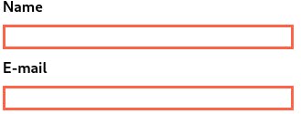
So to avoid complicating our lives there is another pseudo-class that suits exactly when the user inputs a wrong value, the :user-invalid pseudo class. By using it we can now make the user take notice when the field is being incorrectly filled.
<form>
     <label forHTML="name">Name</label>
     <input id="name" type="text" />
     <label forHTML="email">E-mail</label>
     <input id="email" type="email" pattern="[A-Za-z0-9._%+-]+@[a-z0-9.-]+\.[a-z]{2,}$"/>
</form>
css:
from input:valid{
  border: 3px solid powderblue;
}

from input:user-invalid{
  border: 3px solid red;
}
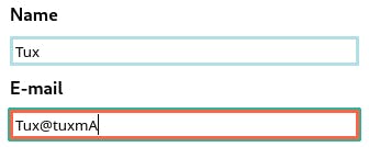
The patter on the email input says that there can not be upperCase letters after the @ symbol so when user inputs the letter A now the field is applied with the invalid styles.
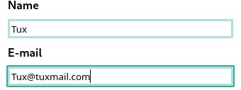
Also when the input detects that the value is now correct according to the parent, the valid styles are applied.
Organizing form elements
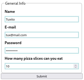
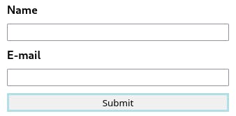
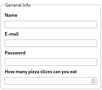
Keeping the form elements organized in groups according tho the type of information required (for example user info like name,email,phone number) can help with both validation and for a more organized flow of the form. For this purpose the element fieldset help us to organize form elements inside groups.
<form>
<fieldset>
<legend>General Info</legend>
   <label htmlFor="name">Name</label>
  <input id="name" type="text" required/>
  <label htmlFor="email">E-mail</label>
  <input id="email" type="email"  required pattern="[A-Za-z0-9._%+-]+@[a-z0-9.-]+\.[a-z]{2,}$"/>
  <label htmlFor="password">Password</label>
  <input id="password" type="password" required patter="^(?=.*\d)(?=.*[a-z])(?=.*[A-Z])(?=.*[a-zA-Z]).{8,}$"/>
  <label htmlFor="slices">How many pizza slices can you eat</label>
  <input id="slices" type="number" min="0" max="16" required/>
</fieldset>
</form>
The legend element is used to show the fieldset title.
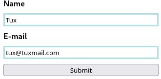
We can also take advantage of the fieldset to apply styles, like the previous problem we have applying the :valid styles to the fields that have been correctly filled, but the style was also applied to all the elements without the required attribute, like the submit button.
We can specified to apply styles to all :valid elements but inside the fieldset while the
html:
<form>
<fieldset>
<legend>General Info</legend>
   <label htmlFor="name">Name</label>
  <input id="name" type="text" required/>
  <label htmlFor="email">E-mail</label>
  <input id="email" type="email"  required pattern="[A-Za-z0-9._%+-]+@[a-z0-9.-]+\.[a-z]{2,}$"/>
  <label htmlFor="password">Password</label>
  <input id="password" type="password" required patter="^(?=.*\d)(?=.*[a-z])(?=.*[A-Z])(?=.*[a-zA-Z]).{8,}$"/>
  <label htmlFor="slices">How many pizza slices can you eat</label>
  <input id="slices" type="number" min="0" max="16" required/>
</fieldset>
 <input type="submit" value="Submit" />
</form>
css:
fieldset > *:valid{
  border: 3px solid powderblue;
}

fieldset >*:user-invalid,:out-of-range{
  border: 3px solid tomato;
}
We select all direct children of fieldset that are valid, user-invalid and out-of-range and apply the styles while the submit button will remain with the default style.
But remember, if there are elements without the required attribute inside the fieldset we will have to specify to which elements the styles will apply.